Why Do Some Photos Look Better Than Others?
Some photographs hold attention immediately while others feel merely competent. The difference is usually not the subject alone, but how clearly the frame establishes hierarchy, timing, and balance.
TL;DR
Better photos usually make stronger selections: they tell you what matters, when it matters, and how the frame should hold together.
Visual hierarchy is often the biggest difference between a compelling image and a merely descriptive one: the viewer knows what to look at first.
Timing is broader than action-catching; a frame often improves when gesture, spacing, and geometry align at the right instant.
Balance is not just symmetry. It is the control of visual weight, especially at the edges and in secondary details.
Comparing near-identical frames is one of the fastest ways to understand why one image is stronger than another.
Rules can help, but strong photographs usually work because their choices serve the picture’s purpose, not because they tick compositional boxes.
A serious amateur eventually reaches a frustrating stage in photography: exposure is reliable, focus is fine, and basic composition no longer feels mysterious, yet some pictures still look flat or forgettable while others seem to hold attention immediately. The difference is rarely explained well by simple rules alone. Across the strongest sources here, the better explanation is that strong photographs make stronger selections. They organize the rectangle more clearly, choose a more meaningful moment, and prevent accidental detail from competing with the point of the image.
That shift matters because photography is not just a way of recording what was in front of the camera. MoMA materials on John Szarkowski’s The Photographer’s Eye describe photography through medium-specific problems such as the thing itself, detail, frame, time, and vantage point, and stress selection as fundamental to the medium. Getty’s educational material adds a practical method: describe what is visible first, then analyze how the picture works. Together, those ideas give us a better answer to the question in this article than composition slogans do.
So why do some photos look better than others? Usually because they establish a clearer visual hierarchy, choose a moment when the scene becomes photographically meaningful, and balance visual weight so the frame feels intentional instead of accidental. In this article, we will compare stronger and weaker kinds of images, explain precisely why one version often wins, and end with practical ways to apply that thinking in the field and during editing.
The real difference is selection, not just subject matter
One of the most useful documented ideas in this research is that photography is a medium of selection rather than synthesis. You do not build the world from scratch; you choose a slice of it. That means two photographers can stand in front of the same person, street corner, or landscape and make images of very different quality, not because one subject was better, but because one set of choices about frame, time, detail, and vantage point was stronger. This framework comes directly from MoMA’s presentation of Szarkowski’s thinking and is a more durable guide than checklist advice about rules alone.
This also explains why impressive subjects do not automatically become impressive photographs. A dramatic mountain, a beautiful face, or a lively street scene may already feel interesting in person because you are experiencing scale, atmosphere, sound, memory, or social context. The photograph has none of that unless the frame creates it. A better image is usually not the one that found the most exciting thing. It is the one that made the visual consequences of that thing clear.
A strong subject can still produce a weak photograph.
A modest subject can become compelling if the frame organizes it well.
When two photos of the same scene differ in quality, the difference is often selection rather than equipment.
Question | Weak answer | Stronger answer |
|---|---|---|
What makes this photo good? | The subject was interesting | The photographer made the subject legible inside the frame |
Why does this version win? | It follows more rules | It makes clearer decisions about hierarchy, timing, and balance |
How do I improve? | Find better places | Learn to compare and refine your choices |
Visual hierarchy: the viewer should know what matters first
Visual hierarchy is the order in which the eye notices things. In practice, it is often the most immediate reason one photo looks better than another. If the viewer can tell what matters first, second, and third, the image feels coherent. If several unrelated elements shout at equal volume, the image feels vague, noisy, or merely descriptive. Getty’s formal-analysis approach supports this way of looking because it asks viewers to identify what is actually visible and how the picture organizes attention, rather than jumping straight to taste.
What creates hierarchy? Usually some combination of brightness, contrast, sharpness, scale, color emphasis, recognizable forms such as faces or text, and placement within the frame. A tiny bright patch near an edge can overpower a larger but subtler subject. A red sign can outcompete a person’s expression. A busy high-contrast background can reduce a portrait to just another shape. Better images do not eliminate all secondary detail, but they give secondary detail a supporting role.
This is why photographers often improve more by moving than by changing settings. A small step to the side can put a face against a quieter background. Lowering the camera can separate a figure from a bright distraction. Waiting for the subject to enter cleaner light can make the intended focal point obvious. The result is not simply prettier composition. It is clearer visual instruction to the viewer: start here, then move there.
Ask what the eye notices first.
Then ask whether that is what you intended.
If not, change the frame before changing the lens or menu settings.
Hierarchy problem | What it looks like | Common fix |
|---|---|---|
Main subject not obvious | Eye bounces between several bright or contrasty areas | Reframe, simplify, or wait for cleaner separation |
Background competes with subject | Important shapes merge or carry equal emphasis | Move position or use light/tonal contrast to separate |
Edge distraction dominates | A bright sliver or object at the border steals attention | Change framing and inspect corners before shooting |
Comparison 1: why one portrait or street frame feels stronger than another
Consider a common comparison. In the weaker version, a person stands in an interesting place, but the background is equally sharp and contrasty, a bright object sits near the edge, and the subject’s outline partly merges with surrounding forms. The frame is not technically wrong. It simply does not establish a main event. In the stronger version, the person is separated tonally or spatially, distractions are excluded or reduced, and the background still contributes context without demanding equal attention. The second image usually looks better because it tells the viewer what to care about first.
Notice that this comparison is not about obeying a fixed rule such as the rule of thirds. The stronger frame could be centered or off-center. It could include negative space or feel tightly cropped. What matters is whether the placement, background, and edge behavior serve the picture’s intention. If the image is meant to describe a person in relation to a place, the place should support that reading. If the place is visually louder than the person, the hierarchy has probably failed.
A useful field exercise is to make three versions of the same subject: one from your first instinctive position, one after moving to simplify the background, and one after waiting for the light or gesture to strengthen the subject. Review them later without remembering which was hardest to make. Ask only: where does my eye go first, and is that the right answer? That review method is strongly consistent with Getty’s emphasis on description before judgment and with Miru’s advice on learning to read frames more honestly.
Stronger hierarchy often comes from small changes, not dramatic ones.
A good background supports the subject instead of competing with it.
If two frames have the same subject, judge the relationship, not the subject alone.
Same scene | Weaker frame | Stronger frame |
|---|---|---|
Person in street | Background equally loud; bright edge distraction | Subject separated; secondary detail stays secondary |
Environmental portrait | Context overwhelms face or gesture | Context deepens meaning without taking over |
Close candid | Expression good but merger behind head | Cleaner outline and clearer focal point |
Timing is not just action-catching
Timing is often taught badly. Many photographers hear some version of shoot faster, react quicker, or capture the decisive moment, as if better images mainly come from reflex. The external evidence here supports a broader and more useful model. MoMA’s framework treats time as one part of a larger photographic system that also includes frame and vantage point, and ICP’s material on Cartier-Bresson notes that the famous English title The Decisive Moment simplified a more complex original framing. That does not make timing unimportant. It means timing should be understood together with geometry, spacing, and selection rather than as pure magic.
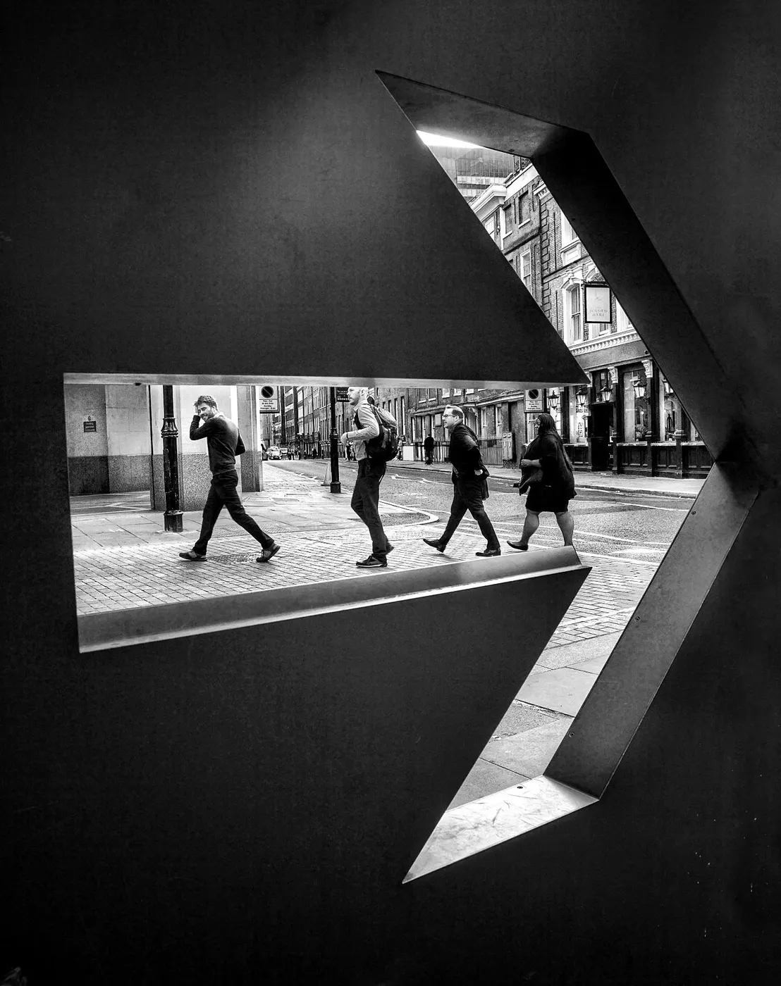
In practice, the right moment is often the instant when a moving element finally serves the existing structure of the frame. A pedestrian reaches the gap between two poles. A cyclist enters the curve that echoes the architecture. A hand separates from a dark coat. Two people stop overlapping and become legible as distinct forms. These are timing decisions, but they are also spacing and hierarchy decisions. The better-timed frame often wins not because more action happened, but because the action became photographically clear.
This is one reason the most useful timing exercise is usually to build the frame before the event. Find stable geometry, light, and edges first. Then wait for the figure, gesture, or movement that activates the structure. That approach aligns closely with MoMA’s frame-time-vantage-point model and with Magnum’s use of contact sheets to show process and alternatives rather than one-shot genius.
Timing is often about spacing, not spectacle.
A frame can be too early, too late, or exact even when the subject is the same.
Build structure first, then wait for the event that completes it.
Bad timing advice | Why it fails | Better approach |
|---|---|---|
Shoot faster | Does not tell you what the frame needed | Pre-compose and wait for the right spacing |
Chase action everywhere | Too many variables change at once | Keep frame stable enough to learn from comparisons |
Trust instinct only | Makes review vague and mystical | Compare early, peak, and late frames side by side |
Comparison 2: why one moving-subject frame is too early, too late, or exact
Imagine three nearly identical frames of a person crossing a doorway filled with strong light. In the first frame, the person is still partly merged with the door frame and not fully inside the lit area. In the second, the body is cleanly separated, the stride is legible, and the figure sits at a useful distance from nearby edges. In the third, the person has moved too far and now feels cramped against another object or the edge of the frame. The middle image usually feels best because geometry and event reinforce each other.
This kind of comparison matters because it shows how tiny differences can change the whole photograph. The subject has not changed. The location has not changed. The light may be nearly identical. Yet one frame feels exact and the others feel approximate. Magnum’s contact-sheet material strongly supports using adjacent frames to understand those differences, since contact sheets let viewers retrace movement through time and space and see why the final selection won.
A careful caution is needed here. The claim is not that every strong photograph depends on a fleeting split-second climax. Some genres rely on quieter timing: the slow arrival of cloud shadow in a landscape, a relaxed expression in a portrait, or the moment architecture gains shape from light. But even in those cases, the practical question remains useful: why this moment instead of the one just before or after? If you cannot answer, the frame may be between moments.
Too early often means the subject has not become legible yet.
Too late often means spacing has collapsed or pressure at the edge has become awkward.
Exact timing often looks calmer and clearer, even when the subject is in motion.
Frame timing | Typical visual problem | Why the selected frame wins |
|---|---|---|
Too early | Subject merged with background or entering shape awkwardly | The chosen frame gives clean separation |
Exact | Gesture and spacing align with structure | Event and frame support each other |
Too late | Subject crowded by edge or overlap | The chosen frame keeps balance and legibility |
Balance is visual weight, not symmetry
Balance is often misunderstood as symmetry or equal distribution. In photographs, a more useful definition is the distribution of visual weight across the rectangle. Weight can come from brightness, contrast, saturated color, a face, readable text, a hard edge, scale, isolation, or a form pushed near the frame boundary. A photo may be asymmetrical and still feel beautifully balanced, while a symmetrical photo may feel dead or unstable if the important weight falls in the wrong place.
This is where edge control becomes decisive. Many competent photos feel weaker than they should because of secondary problems at the borders: a clipped hand, a bright sliver in the corner, a branch touching a head, a near-tangent between two shapes, or a background element that acts louder than the subject. These are small issues in one sense, but they are often exactly what separates a good frame from a nearly good one. Getty’s analytical approach supports this level of close looking, and Miru’s archive repeatedly emphasizes the edges as places where photographs succeed or fail.
Balance also depends on what kind of photograph the image is trying to be. A quiet landscape may need broad tonal stability. A street picture may benefit from productive tension between figures. A portrait may tolerate asymmetry if the face still anchors the frame. So balance should not be treated as a universal formula. It is better understood as the degree to which visual weight helps rather than fights the picture’s purpose.
A small bright object can outweigh a large dark shape.
Symmetry is one kind of balance, not the definition of balance.
The edges often reveal whether the frame is intentional or careless.
Balance issue | What it does to the image | Practical response |
|---|---|---|
Bright corner highlight | Pulls attention away from subject | Reframe or wait for different light |
Tangent or merger | Makes forms feel accidental | Move slightly to create separation |
Heavy empty side with no purpose | Creates drift rather than tension | Crop, recompose, or add a counterweight |
Clipped important form | Feels careless unless clearly intentional | Adjust framing before shooting |
Comparison 3: same subject, same light, different balance
Consider two photos of the same seated subject beside a window. In the weaker frame, the face is well lit, but a bright curtain edge at the far side competes strongly, a cropped hand feels accidental, and a dark object in the foreground creates unnecessary weight. In the stronger frame, the curtain edge is excluded, the hand is either fully included or decisively cropped, and the subject’s face remains the brightest readable element. Nothing dramatic has changed, yet the second image looks much more resolved.
What improved? Not the subject. Not the equipment. Mostly the distribution of attention. The stronger frame gives the viewer less uncertainty about what matters and less opportunity to escape the picture through the edges. This kind of comparison is especially useful for serious amateurs because it reveals that many quality gains are compositional rather than technical. The file may already be sharp enough. The real question is whether the frame is organized enough.
If you want to train this skill, review your photos small first. Squint or shrink them until only major weights remain. Where does the eye land? Which corner becomes too loud? Then inspect the edges closely. This two-step review method is an editorial synthesis rather than a direct quotation, but it fits well with Getty’s describe-then-analyze model and Miru’s emphasis on hierarchy and edge behavior.
When balance improves, the image often feels calmer even if the composition remains dynamic.
Cropping decisions affect visual weight as much as subject placement does.
Small edge problems can be more damaging than obvious center-frame issues.
Nearly identical frame pair | Why weaker | Why stronger |
|---|---|---|
Window-lit portrait | Bright border and awkward crop compete | Cleaner borders and clearer main weight |
Landscape with small figure | Figure lost against equal-weight background | Figure separated and held by surrounding space |
Street scene | Secondary sign dominates | Sign supports place but no longer wins |
Why contact sheets matter more than myths
One of the most practical findings in the supplied research is Magnum’s emphasis on contact sheets. Contact sheets matter because they reveal that many famous or effective photographs are not isolated miracles. They are selections made from nearby alternatives. Looking at adjacent frames helps us see what changed: a step left, a cleaner overlap, a better expression, one less distracting edge, a more precise gesture. This supports a healthier way of learning than mythologizing talent.
For serious amateurs, this changes how editing should work. Do not judge a photo only as a single image. Compare its neighbors. Ask what the winning frame solved that the others did not. Often the answer will be surprisingly specific: the hand separated, the face turned, the cyclist entered the curve, the background quieted, the corner stopped glowing. Those are learnable observations. They are much more useful than saying one frame just feels stronger.
Edit in sequences, not just singles.
Near-misses are educational if you can describe why they missed.
A stronger photo often wins by a very small margin that becomes obvious only in comparison.
What to compare in adjacent frames | Why it matters | What to look for |
|---|---|---|
Subject spacing | Changes legibility and tension | Too close, too far, or exact |
Gesture or expression | Affects meaning and energy | Peak, flat, or awkward transition |
Background relationship | Controls hierarchy | Cleaner separation or stronger merger |
Edge behavior | Determines finish and balance | Intrusions, tangents, clipped forms |
A practical critique method: describe first, judge second
Getty’s educational framework is especially useful because it slows criticism down. First describe what is in the image. Then reflect on what it suggests. Then analyze the formal decisions. That order matters. Many photographers jump straight to I like it or I do not like it, which mixes taste, memory, and intention too quickly. Description helps you see what the frame is actually doing rather than what you hoped it was doing.
A useful practical sequence for your own editing is this. First: what do I notice first, second, and third? Second: what makes those things dominant or weak? Third: is the moment early, late, or exact? Fourth: what at the edges helps or hurts the frame? Fifth: if I compare this with neighboring images, what specifically improved or worsened? These questions turn critique from vague preference into diagnosis.
Description reduces self-deception during editing.
Diagnosis is more useful than praise or dislike.
A critique question should reveal what the image is doing, not just whether it is liked.
Critique question | Why it helps | What it reveals |
|---|---|---|
What do I notice first? | Tests hierarchy | Whether the main subject is actually dominant |
Why this moment? | Tests timing | Whether the image is exact or in-between |
Where does the frame leak? | Tests balance and edge control | Distractions, tangents, and visual escape routes |
Exercises to make your photos stronger
If you want to improve quickly, use exercises that isolate one variable at a time. For hierarchy, photograph one subject against three different backgrounds and compare which frame clarifies the subject best. For timing, pre-compose a structured scene and make short early, peak, and late sequences as people pass through it. For balance, photograph the same subject with small changes in framing and inspect which version controls the edges most convincingly. These exercises are consistent with the research emphasis on comparison, sequence, and formal analysis.
Another effective habit is to study your own near-misses. Pick ten almost-good photographs and write one sentence explaining why each falls short. Be specific: bright corner, merged head, weak gesture, subject too small to carry the frame, background louder than face. Then ask what field decision would have fixed it: move left, wait half a second, lower the camera, step closer, exclude the sign. This practice aligns closely with Miru’s broader argument that stronger photography grows from better decisions, not just better equipment.
Practice comparison, not just shooting volume.
Build exercises around repeatable scenes so differences are visible.
Write down the reason a frame failed; naming the problem makes it easier to see next time.
Exercise | What to keep stable | What to compare |
|---|---|---|
Hierarchy drill | Same subject | Background, brightness, and separation |
Timing drill | Same frame and location | Early, exact, and late subject placement |
Balance drill | Same subject and light | Edge behavior and visual weight |
Editing drill | Same sequence | Why one frame beats adjacent alternatives |
When rules help, and when they do not
None of this means rules are useless. Rules can be good beginner shortcuts because they encourage awareness of placement, line, spacing, or simplification. The problem comes when rules replace analysis. A centered subject can be powerful if it strengthens directness or symmetry. Blur can help if it serves motion or atmosphere. A visually busy frame can work if hierarchy still exists and the complexity is organized. Better photos usually do not win because they obey rules more strictly. They win because their choices suit the picture better.
That is why serious amateurs often outgrow rule-based improvement before they fully trust their eye. The next step is not abandoning structure but becoming more precise about what structure does. Ask not, is there a leading line, but what job is the line doing? Ask not, is the subject off-center, but what does that placement create? Ask not, is the moment decisive, but what changed in the frame when I pressed the shutter? Those are the kinds of questions that turn taste into craft.
Rules are starting points, not verdicts.
A convention is useful only if it improves hierarchy, timing, or balance.
Specific questions beat generic advice.
Some photos look better than others because they make stronger photographic decisions. They establish a clearer visual hierarchy, choose a moment when the scene becomes meaningful inside the frame, and balance visual weight so the rectangle feels intentional. That argument is well supported by the sources here, especially the MoMA framework around frame, time, detail, and vantage point, Getty’s method of formal analysis, and Magnum’s emphasis on contact sheets and selection. For a serious amateur, the practical lesson is encouraging: the gap between a competent photo and a compelling one is often not mystery or talent alone. It is the ability to compare frames more honestly and notice what changed. If you learn to ask what matters first, why this moment is better than the one before or after, and what in the frame is accidentally too loud, your photographs will usually get stronger for visible reasons, not magical ones.
Sources and further reading
Henri Cartier-Bresson: The Decisive Moment - International Center of ...
https://www.magnumphotos.com/theory-and-practice/magnum-contact-sheets/
https://store.moma.org/products/the-photographers-eye-paperback
https://media.getty.edu/Text/312a3f2f-39d4-5491-925f-8c5ba400ced5.pdf
https://www.getty.edu/education/teachers/classroom_resources/curricula/exploring_photographs/
https://www.magnumphotos.com/event/collections/contact-sheet-prints/
https://www.icp.org/browse/archive/constituents/henri-cartier-bresson