How to Critique a Photograph: A Step-by-Step Method
A practical critique framework for serious amateurs: describe the frame, identify the image’s aim, test hierarchy, framing, timing, and viewpoint, then name one stronger next move.
TL;DR
Start critique with description, not opinion: say what is visible and what draws the eye first.
Judge the photograph against its likely aim, not against generic rules or your personal taste alone.
Check hierarchy, edge control, timing, detail, and vantage point before blaming gear or editing.
Compare nearby frames when possible; critique becomes clearer when you ask why one version works better than another.
Separate craft problems from taste disagreements so feedback stays specific and useful.
End every critique with one next move for the reshoot, re-edit, or next outing.
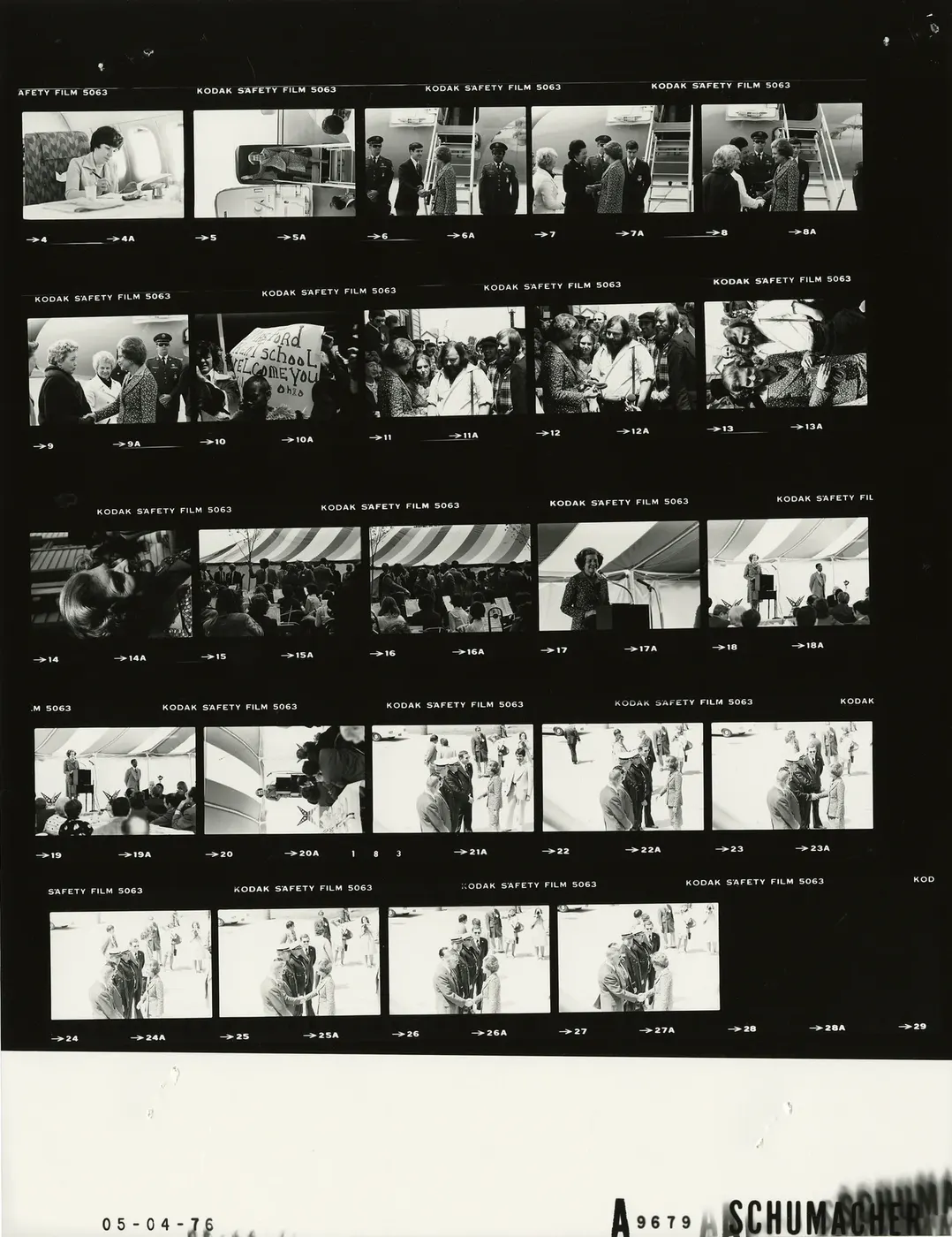
Most weak photo critiques fail in one of three ways: they are too vague, too rule-bound, or too personal. Vague critique says, "It doesn’t work," without explaining why. Rule-bound critique treats every image as if the same compositional checklist should decide it. Personal critique collapses everything into taste: "I just don’t like it." A more useful method begins with careful description, then asks photographic questions about what the image is doing as a photograph. Getty’s educational materials explicitly structure analysis around description, reflection, and formal analysis, while MoMA’s materials on John Szarkowski’s The Photographer’s Eye organize photographic thinking around the thing itself, detail, frame, time, and vantage point rather than generic art advice. Magnum’s writing on contact sheets adds an important editorial lesson: critique often becomes clearest when you compare neighboring frames instead of judging one image in isolation.
For serious amateurs, this matters because the real problem is often no longer exposure or autofocus. The harder problem is diagnosis. You can sense that one frame is stronger than another, but not yet explain why. Miru’s archive returns to the same idea in different forms: good photographs guide attention, clarify what matters, control the edges, and make better decisions about timing, viewpoint, and relationships inside the frame. This article brings those ideas into one repeatable method you can use on your own work or someone else’s.
The goal here is not to produce a universal score or pretend every photograph should work the same way. It is to give you a sequence of questions that turns critique into something practical: describe what is there, infer what the photograph is trying to do, test how the frame supports or weakens that aim, and finish with one clear next move. Some parts of this framework come directly from the external sources, and some are practical synthesis for photographers in the field. Where the framework is a synthesis rather than a published institutional checklist, it is presented that way.
White House Photographic Office (WHPO) - Schumacher — Public domain. Resized and compressed to WebP; visual content unchanged. Original image.
Why critique matters more than another tip or another lens
Once your photographs are usually sharp and correctly exposed, improvement slows because the remaining problems are less technical and more visual. A technically clean photograph can still be weak if the eye goes to the wrong place, the frame includes too much, the moment is slightly off, or the subject never becomes clear. Miru’s articles on photographic clarity and stronger seeing make this distinction repeatedly: technical quality affects whether a file is usable, but hierarchy, relationships, and attention determine whether the image communicates.
That is why critique is not an optional afterthought. It is how you learn to connect effect to cause. Getty’s teaching materials support this by treating photographic analysis as a learnable process rather than a gift, and Szarkowski’s categories provide durable photographic questions to ask of almost any image: what is the thing itself, which details matter, how does the frame work, why this moment, and why this viewpoint. Those questions are broad enough to apply across genres, but specific enough to guide actual editing decisions.
My own interpretation is that good critique replaces the vague idea of "having an eye" with trainable habits of noticing. Instead of asking only whether the photograph is good, you ask where attention goes, what competes with the subject, what the edges do, and whether the chosen moment and vantage point serve the picture. That does not remove taste from photography, but it does keep taste from doing all the talking.
Critique is diagnosis, not verdict.
It helps you explain why one frame works better than another.
It turns editing into a skill rather than a mood.
It gives you a concrete next action instead of a vague feeling.
Weak critique habit | Why it fails | Stronger alternative |
|---|---|---|
"I like it / I don’t like it" | Mostly reports taste, not cause | Describe what is visible and where the eye goes |
Rule-checking only | Can punish images that succeed by other means | Judge whether the choices serve the image’s aim |
One-image isolation | Hides what changed between versions | Compare neighboring frames or alternate crops |
Only praising strengths | Feels good but teaches little | Name one strength, one weakness, one next move |
Step 1: Describe before you judge
Begin with plain description. What is literally in the frame? What do you notice first, second, and third? What appears to be the main subject? Getty’s educational material is especially useful here because it separates description from later reflection and formal analysis. That slows the common amateur habit of jumping straight to approval or disapproval before the picture has even been looked at carefully.
This sounds simple, but it changes the quality of critique immediately. If you cannot describe what the photograph contains and how attention moves through it, you are not yet in a strong position to judge it. Description also helps uncover disagreement. Two viewers may differ in taste, but if both describe the same bright distraction at the edge or the same ambiguity about the subject, the critique already has useful common ground.
A practical way to do this is to force yourself into neutral language first. Say, "A person stands near the left side of the frame in hard light; a bright sign at the right edge pulls attention; the background contains two darker figures." Only after that do you ask whether those facts help or hurt the image. This habit keeps critique observable before it becomes interpretive.
Name the subject in literal terms first.
List what the eye notices in order.
Describe bright areas, faces, text, and strong lines.
Delay judgment for at least one full pass.
Bad opening question | Better opening question |
|---|---|
Is it good? | What is actually in the frame? |
Do I like it? | What do I notice first, second, third? |
What rule did it break? | How is attention organized? |
What preset would fix it? | What visible problem is making it weaker? |
Step 2: Ask what the photograph is trying to do
Before you criticize the choices, ask what the image seems to be trying to do. Is it trying to describe a place clearly, isolate a gesture, build mood, emphasize scale, record an event, or make a visual pattern? This exact step is a practical synthesis rather than a named Getty or MoMA checklist item, but it is strongly compatible with Getty’s reflection stage and with Miru’s repeated argument that photographs should be judged in relation to their intention rather than by generic rules.
This step prevents category errors. A quiet, ambiguous photograph may fail if judged as straightforward description but succeed if judged as mood or tension. A messy street picture may be weak if the mess is accidental, but strong if that density is the subject and the frame still gives the eye a way through. Intention does not excuse every problem, but it changes which problems matter most.
If intention is hard to name, use a modest version of the question: what seems to matter most here without a caption? That phrasing is useful because it asks what the image communicates on its own. If the photograph depends entirely on a story the viewer cannot see, critique should note that gap.
Do not assume every photo wants maximum clarity.
Judge the image against its likely purpose.
If the aim is unclear, that may itself be part of the critique.
Possible aim | Questions to ask |
|---|---|
Description | Can I tell what matters without a caption? |
Mood | Do light, color, and space support the feeling? |
Timing | Does this moment beat the one before and after? |
Structure | Are shape, spacing, rhythm, or geometry doing the work? |
Step 3: Follow the eye and test hierarchy
Once you have described the frame and guessed its aim, follow your own eye through the picture. Where does it land first? Is that where it should land? Hierarchy is one of the clearest practical ideas in Miru’s archive: a photograph becomes more legible when something leads, something supports, and less important elements stay quieter. A bright edge, face in the background, patch of text, or sharp highlight can easily outrank the intended subject if the frame gives it too much power.
This is also where critique begins to separate craft from preference. If most viewers notice an irrelevant object before the subject, that is not merely a taste issue. It is evidence that the frame’s attention system may be misfiring. Getty’s formal-analysis approach supports this kind of close reading because it teaches viewers to identify how compositional elements direct attention and create emphasis.
A useful field language here is subject, competitor, edge, relationship, future. The subject is what the image needs you to notice. The competitor is whatever steals attention from it. The edge is where accidents survive. The relationship is the reason the parts belong together. The future is what might happen if you wait another moment. That phrasing comes from Miru’s practical teaching rather than the external sources, but it is an excellent diagnostic bridge between seeing and critique.
Look small first; strong hierarchy often survives reduction.
Bright edges and faces often steal attention.
Ask whether distractions are expressive or accidental.
If the eye keeps escaping, inspect the edges.
What pulls attention | Possible effect | Typical fix |
|---|---|---|
Bright patch at edge | Leaks attention out of frame | Reframe, crop, or wait for a cleaner edge |
Text or sign | Becomes louder than subject | Change angle or include it more deliberately |
Background face | Competes with main figure | Move position or wait for separation |
Strong line touching subject awkwardly | Creates accidental tension | Shift viewpoint slightly |

A contact sheet with long strips of sequential negatives. The repeated near-similar frames suggest how small changes in spacing, gesture, or viewpoint can alter which element dominates the picture. David Hume Kennerly — Public domain. Resized and compressed to WebP; visual content unchanged. Original image.
Step 4: Read the frame, especially the edges
Szarkowski’s category of the frame remains one of the most useful foundations for critique because every photograph is an act of inclusion and exclusion. The world continues beyond the rectangle, but the picture does not. That means critique should ask why the frame begins and ends where it does, what has been excluded, and whether the edges feel intentional or careless.
Many photographs are weaker than they need to be not because the subject is bad, but because the frame gives too much space to unhelpful context. Miru’s archive makes this point repeatedly: edge behavior matters. A branch entering awkwardly from the corner, a bright parked car clipped at the border, or a hand nearly cut off can make the frame feel unresolved even when the center is strong.
When critiquing, ask two kinds of framing question. First, does the current crop help the idea? Second, would a different position in the field have been better than a later crop? Those are not the same problem. Cropping can improve a picture, but vantage point often changes relationships more profoundly than editing after the fact. That distinction aligns with Szarkowski’s separation of frame and vantage point, even though in practice the two interact closely.
Inspect all four edges separately.
Ask what the excluded world would have added or weakened.
Differentiate crop problems from shooting-position problems.
Treat the border as active, not neutral.
Edge issue | What it often signals | Better question |
|---|---|---|
Bright object half-entering frame | Careless exclusion | Should it be fully included or fully excluded? |
Limb or object awkwardly clipped | Unresolved boundary | Can the crop be firmer or looser? |
Too much dead space | Weak emphasis | Is the context adding meaning or diluting it? |
No room in direction of movement | Compressed gesture | Would more space improve tension or clarity? |
Step 5: Look for the details that carry meaning
Critique should not stop at the large structure of the frame. Szarkowski’s category of detail asks what small visual facts carry the photograph’s weight. A photograph often works because of one hand, one reflection, one repeated shape, one expression, or one small object that anchors the larger scene. Conversely, a frame can weaken when too many details ask for equal attention.
This is one reason serious amateurs benefit from studying photographs slowly. Miru’s article on studying great photographers argues that improvement comes from analyzing decisions and relationships rather than copying subjects. In critique, the same habit applies: ask which specific details justify the picture’s existence. If none of the details seem necessary, the image may be relying on the memory of the scene more than on what the rectangle actually contains.
Try a harsh question: what would the photograph lose if this detail disappeared? If the answer is "not much," the detail may be clutter. If the answer is "the mood collapses" or "the relationship becomes unreadable," you have found a meaningful part of the image. This is interpretation, not a museum formula, but it is a productive extension of detail-based critique.
Meaning often lives in small differences.
Look for the one detail that makes the larger frame necessary.
Remove mental memory of the scene; judge the rectangle only.
Useful detail clarifies; clutter competes.
Detail type | When it helps | When it hurts |
|---|---|---|
Gesture | Reveals emotion or relationship | Unreadable against background |
Reflection | Adds layer or visual echo | Creates confusion without hierarchy |
Repeated shape | Builds rhythm or cohesion | Becomes decorative noise |
Text or sign | Adds context or irony | Distracts if louder than the subject |
Step 6: Ask why this moment
Timing is not only for sports or street photography. Szarkowski’s category of time exposure makes timing a general photographic problem, and Magnum’s contact-sheet writing reinforces the importance of comparing adjacent frames to understand how an image was made. For critique, the practical question is simple: why this moment rather than the one just before or after?
Often the answer lies in small changes: a hand separates from a dark coat, a figure reaches cleaner spacing, a face turns into better light, or two moving parts finally lock into a useful relationship. Miru’s timing exercise emphasizes that good timing is rarely magic reflex alone; it is anticipation plus review, especially through neighboring frames. That makes timing critique more concrete than many photographers assume.
If you have only one frame, timing critique becomes more speculative, so qualify it. You can say, "This feels slightly between moments because the gesture is not fully formed," but you cannot know whether a stronger adjacent frame existed. If you do have a sequence, use it. Ask what changed and whether the chosen frame really is the peak of gesture, spacing, expression, or alignment.
Timing often depends on spacing and separation, not only action.
If possible, compare earlier and later frames.
Be cautious when inferring missed moments from a single image.
A tiny change in gesture can be decisive.
Timing question | If the answer is weak | Possible next move |
|---|---|---|
Why this exact moment? | No clear reason | Review neighboring frames |
Did gesture peak? | Expression or pose feels flat | Wait longer next time |
Is spacing clean? | Subjects overlap awkwardly | Shift position or hold the frame |
Did light and moment align? | Good action in poor light | Pre-compose a stronger stage |

Another contact sheet with repeated related frames, including indoor scenes and podium moments. It visually supports the idea that timing critique often depends on comparing near-identical alternatives rather than trusting memory. David Hume Kennerly — Public domain. Resized and compressed to WebP; visual content unchanged. Original image.
Step 7: Ask why this viewpoint
Vantage point is not merely a technical note about lens choice. In Szarkowski’s framework, it is one of the central decisions that turns the world into a photograph. Critique should therefore ask why the image was made from this height, this distance, and this angle, and what would change if the photographer moved. The question matters because viewpoint affects background relationships, subject prominence, geometry, and emotional distance all at once.
A common amateur mistake is to treat the first workable viewpoint as fixed and then try to solve the picture with settings. Miru’s archive argues the opposite: moving your body is often more important than changing the camera. Lowering the camera can simplify a background; stepping left can separate a head from a pole; moving closer can remove dead context; moving back can reveal a relationship the tighter crop hides.
When you critique viewpoint, be specific. Avoid vague comments like "maybe try a different angle." Say what the angle would change: cleaner subject-background separation, stronger geometry, more breathing room, less overlap, or a more believable sense of scale. Specificity keeps critique actionable.
Viewpoint changes relationships, not just composition style.
Distance affects both subject clarity and context.
Height can change background clutter dramatically.
A good critique names what a new viewpoint would improve.
Viewpoint change | What it may improve | Trade-off to watch |
|---|---|---|
Move closer | Stronger subject emphasis | Loss of contextual meaning |
Step sideways | Cleaner separation and spacing | May weaken balance elsewhere |
Change height | Removes merges and clutter | Can flatten or exaggerate perspective |
Step back | Shows broader relationship | Subject may lose dominance |
Step 8: Separate craft from taste
Not every disagreement in critique means the photograph is impossible to judge. Some questions are largely craft questions: is the subject blocked by the background, does a bright edge pull attention away, is the frame unintentionally confusing, is a key detail lost in shadow or blur? Other questions involve taste and interpretation: whether ambiguity feels rich or empty, whether the mood matters, whether the picture feels moving or merely restrained. Miru’s article on judging whether a photograph is actually good is especially clear on this distinction.
Getty’s teaching approach supports this separation indirectly because formal analysis asks what the visual elements are doing before students move into interpretation and evaluation. That sequence is useful in critique because it prevents preference from erasing observable problems. You may love dark, ambiguous images and still admit that a bright corner distracts from the intended subject.
This distinction also makes critique more humane. If you say, "I prefer a looser crop," you are reporting taste. If you say, "My eye keeps going to the bright right edge instead of the face," you are reporting a visible effect. Both comments may be useful, but they are not the same kind of statement, and photographers improve faster when the difference is clear.
Craft asks what the frame does.
Taste asks how you respond to it.
Keep the two separate so feedback stays usable.
Visible effect is stronger than personal preference alone.
Statement type | Example |
|---|---|
Craft diagnosis | The subject does not separate from the background |
Craft diagnosis | The edge highlight pulls more attention than the face |
Taste response | I prefer the ambiguity of the wider crop |
Taste response | I find the color palette too sentimental |
A practical annotated example
Imagine a street photograph: one person in a light coat stands near the left third of the frame, pausing under a bright patch of sun. Behind them is a darker storefront with reflected shapes in the glass. At the far right edge, a white sign cuts into the frame. Another passerby is partly visible behind the main figure. We do not have an actual reader image here, so this is a constructed teaching example rather than a documented photograph.
Step 1, description: the brightest areas are the coat and the white sign; the face is smaller than the coat but still legible; the background reflection adds a second layer; the partial passerby creates overlap behind the main subject. Step 2, likely aim: the photograph seems to want a moment of pause and isolation within a busy street. Step 3, hierarchy: the coat works, but the sign at the right edge competes too strongly and may become the second thing the eye notices, perhaps even the first depending on size. Step 4, frame: the right edge feels accidental because the sign is clipped and bright. Step 5, detail: the reflected shapes may help if they echo the figure’s stillness, but they may also clutter the middle tones. Step 6, time: if the passerby is too close behind the main figure, the frame may be slightly early or late. Step 7, vantage point: one step left or lower might separate the figure from the passerby and reduce the sign’s pull.
A concise critique of that picture might read like this: "The image has a promising center of gravity because the light coat anchors the frame and the dark storefront gives contrast. The main weakness is the clipped white sign at the right edge, which competes with the figure and makes the crop feel unintentional. The timing is close but not exact because the background passerby overlaps the subject’s shoulder. On a reshoot, I would hold the same general scene but wait for cleaner separation or shift half a step left to quiet the edge." Notice what this does: it names a strength, a weakness, and one next move.
Describe the frame first.
Infer the aim cautiously.
Name the strongest support for that aim.
Name the strongest obstacle.
End with one next move.
Critique step | Example note |
|---|---|
Description | Bright coat left, dark storefront behind, clipped white sign at right |
Aim | A quiet pause within a busy street |
Main strength | Clear light-dark separation around the figure |
Main weakness | Right-edge sign competes and crop feels accidental |
A saveable critique checklist
If you want a shorter version to keep on your phone or in a notebook, use this sequence. It is a practical synthesis of Getty’s description-first method, Szarkowski’s photographic categories, Magnum’s comparative editing logic, and Miru’s field-ready language about hierarchy, edges, timing, and viewpoint.
1. What is literally in the frame?
2. What do I notice first, second, third?
3. What seems to be the picture’s aim?
4. Is the subject clear, and what competes with it?
5. What do the edges and crop do?
6. Which details carry meaning, and which are clutter?
7. Why this moment instead of earlier or later?
8. Why this height, distance, and angle?
9. Is the main problem craft, taste, or both?
10. What one next move would help most?
If you only have 30 seconds | Ask this |
|---|---|
Clarity | What is the picture asking me to notice? |
Hierarchy | What is stealing attention from that? |
Timing | Is this the strongest moment? |
Next move | What one change would most improve it? |
Try it on one of your own photographs
Choose one image from a recent shoot, ideally along with the frame before and after if they exist. Spend two minutes describing only what is visible. Spend two more naming the image’s likely aim. Then spend four minutes testing hierarchy, frame, detail, time, and vantage point. Use the last two minutes to write one next move. If you do this regularly, critique becomes less theatrical and more diagnostic.
If you want the exercise to teach you faster, avoid your obvious favorite at first. Pick a good but imperfect frame. The lesson is often clearer there than in a photograph you either love uncritically or dismiss too quickly. Miru’s articles on editing, timing, and clarity all support this practical idea: near misses are often the best teachers because they let you see what almost worked.
You can also do this with a friend, but use disciplined language. Start with description. Separate visible effects from preferences. Ask for one strength, one weakness, and one next move. That structure produces better conversations and, more importantly, better photographs.
Pick one image and, if possible, its neighbors.
Describe before judging.
Judge against the image’s likely aim.
Name one strength, one weakness, one next move.
Repeat on five images from the same shoot to see patterns.
10-minute self-critique | Time |
|---|---|
Description only | 2 minutes |
Likely aim | 2 minutes |
Hierarchy, frame, detail, time, vantage point | 4 minutes |
Write one next move | 2 minutes |
A useful photo critique does not ask for a verdict first. It asks for evidence. What is visible? Where does attention go? What seems to matter? How do detail, frame, time, and vantage point support or weaken that aim? Once you work this way, critique becomes less about sounding perceptive and more about making stronger decisions. That is the real point. Not to prove that a photograph is good or bad, but to understand what the next better photograph requires.
Sources and further reading
https://www.magnumphotos.com/theory-and-practice/magnum-contact-sheets/
https://assets.moma.org/documents/moma_press-release_326341.pdf
https://store.moma.org/products/the-photographers-eye-paperback
https://www.getty.edu/education/teachers/classroom_resources/curricula/exploring_photographs/
https://www.magnumphotos.com/theme/magnum-contact-sheets/?mc_cid=149d47ca72&mc_eid=c5e08cad80