How to Use Negative Space in Photography
A practical guide for serious amateur photographers who want cleaner, stronger images by learning how space controls attention.
At some point, better gear stops solving the problem. You can buy a sharper lens, watch another tutorial, or memorize one more composition rule, but your photos may still feel crowded, flat, or almost good. Often the missing skill is not technical. It is learning to see the whole frame, not just the subject.
Negative space is one of the fastest ways to build that eye. It is the quiet area around or between the important parts of a photograph: sky, snow, fog, water, shadow, wall, pavement, empty table, soft blur, or even a dark gap between two shapes. It is not wasted space. Used well, it tells the viewer where to look, how large the subject feels, what mood the picture carries, and whether the frame feels calm, tense, lonely, formal, or open.

Photo: Jacob W. Frank / National Park Service, "Lone tree and snowy hills in Hayden Valley," 2017. Public domain via Wikimedia Commons. Source: https://commons.wikimedia.org/wiki/File:Lone_tree_and_snowy_hills_in_Hayden_Valley.jpg
Stop Looking Only For Subjects
Most photographers start by finding a subject and then trying to clean up the background. That is natural, but it keeps you one step behind the picture. A stronger approach is to look for a relationship: subject and field, figure and ground, object and space.
Before you press the shutter, ask a simple question: what is the empty area doing? If the answer is only "it makes the photo cleaner," keep working. Strong negative space usually does something more specific. It can make a person feel small in a landscape, give a runner room to move, make a portrait feel quiet, turn a building into a set of shapes, or make a tiny gesture stand out against a large wall.
This is why negative space is not the same thing as minimalism. A photo can be simple and still weak if the empty area is just leftover frame. A photo can also be visually rich and still use negative space well if the spaces between shapes create order. The goal is not to remove everything. The goal is to make the frame easier to read.
Think In Shape, Weight, And Direction
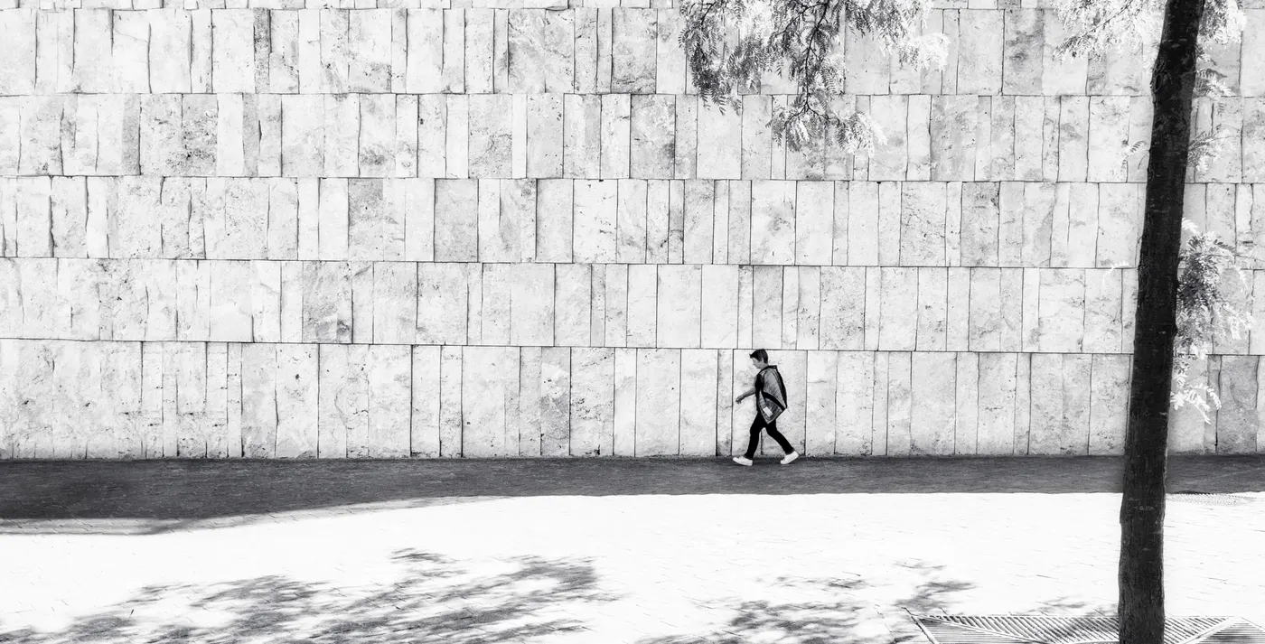
When you are composing, try to see the frame before you name the objects in it. Instead of thinking "person, wall, street," think "small dark figure, large pale rectangle, diagonal shadow." This helps you judge the image as a photograph, not just as a record of what was in front of you.
Visual weight does not come only from size. A small face, hand, bird, word, or bright highlight can pull the eye harder than a large empty sky. Sharpness, contrast, color, meaning, and position all matter. A tiny person near the edge of a huge white field may still dominate the image because the viewer understands the human figure immediately.
Direction matters too. If someone is walking, looking, pointing, leaning, or moving, the space around them changes the feeling. More space in front of them can feel like possibility. Less space can feel like pressure. A subject near the center can feel still and formal. A subject close to the edge can feel unstable, private, or about to leave.

Photo: Magdalena Roeseler, "Minimalist photo of a person walking close to the wall," 2017. Licensed CC BY 2.0 via Wikimedia Commons. Source: https://commons.wikimedia.org/wiki/File:Minimalist_photo_of_a_person_walking_close_to_the_wall.jpg
The Empty Area Needs A Job
A useful habit is to finish this sentence before making the picture: "The space is here to make the subject feel ____." Good answers are words like smaller, lonelier, faster, calmer, exposed, suspended, formal, fragile, or uncertain. Weak answers are words like clean, nice, simple, or balanced.
This test works because it forces you to decide whether the space is active. In a landscape, empty sky may create scale. In a portrait, a plain wall may make a face feel more intense. In street photography, an empty patch of light may feel like a stage waiting for the right gesture. In macro work, the dark gap between petals may matter as much as the petals themselves.
Once you know the job of the space, you can make better choices. Move closer if the field is doing nothing. Step back if the subject needs room to breathe. Shift left or right if the space is pulling attention away from the subject. Wait if the frame is strong but needs one small human event to complete it.
Negative Space Is Also About Edges
Quiet space makes small problems louder. A branch touching a head, a bright dot near the corner, a sliver of window at the edge, or a horizon that almost but not quite lines up can damage the whole frame. In a busy photo, those details may hide. In a sparse photo, they become events.
Before taking a deliberate negative-space photograph, scan the frame clockwise. Look at each edge and each corner. Ask what is entering, what is cut off, what is touching, and what is brighter than it should be. This takes a few seconds, but it trains exactly the kind of seeing that serious amateurs need once gear and tutorials have stopped giving easy gains.
Miru is built around this same problem: helping photographers notice where attention goes, what competes with the subject, and what the frame is actually doing. Negative space is a good training ground because it makes those relationships easier to see.
Try The Same Subject Three Ways
One of the best exercises is to photograph the same subject at three different scales. Make one frame where the subject is clearly dominant, one where the subject shares the frame with its environment, and one where the subject is small inside a large field. Do not change lenses if you can avoid it. Move your body and feel how the meaning changes.
In the large version, you may get description: face, texture, detail, expression. In the middle version, you may get relationship: person and street, tree and snow, cup and table. In the small version, you may get atmosphere: silence, distance, vulnerability, or scale. None of these is automatically better. The point is to learn what each amount of space does.
After editing, place the three versions side by side. Ask which one feels clearest, which one feels most emotional, and which one surprised you. This comparison is more useful than asking whether one photo follows the rule of thirds.

Photo: Imogen Cunningham, "Magnolia Blossom," 1925. Public domain via Wikimedia Commons. Source: https://commons.wikimedia.org/wiki/File:MagnoliaBlossom1925.jpg
Do Not Confuse Blank With Good
The biggest mistake with negative space is making empty pictures that have no tension. A blank sky is not meaningful just because it is blank. A white wall is not strong by itself. A large soft background is not automatically more refined than a detailed one.
The space has to support the photograph's idea. A snowy field can make a tree feel isolated because the tree still has enough shape and contrast to hold the frame. A soft background can work in a portrait because it keeps attention on the eyes and contour. A wall in a street scene can work because a small human figure activates the scale of the architecture. Without that relationship, the space is just area.
Texture can help. Fog, grain, snow, water, shadow, and subtle color shifts can keep the negative field alive without making it busy. The trick is to preserve enough information for mood and place, but not so much that the field starts competing with the subject.
Exposure And Editing Matter
Negative space exposes sloppy technique. Large bright fields can fool your meter and turn snow or white walls gray. Large dark fields can get lifted into dull mud. Simple skies show sensor dust. Smooth backgrounds show banding, noise, and overdone editing.
Use the histogram as a warning system, not as a rule. A mostly white scene should often have a histogram pushed toward the bright side. A mostly dark scene may live mostly on the left. The important question is whether the tones you care about are clipped or muddy. Shoot RAW when the field has subtle gradients, because those small tonal changes may be the mood of the picture.
When editing, adjust the relationship first. Does the subject separate from the field? Does the field still feel like sky, fog, wall, water, or snow rather than a flat digital slab? Are there small distractions near the edges? Crop last, and compare versions. If removing a big area of space changes nothing, that space was probably not doing enough.
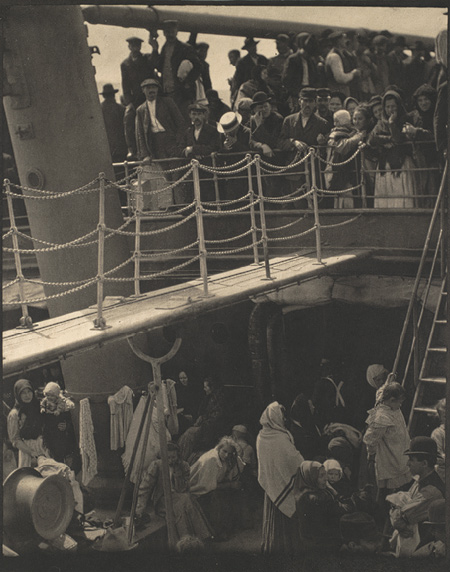
Photo: Alfred Stieglitz, "The Steerage," 1907. Public domain via Wikimedia Commons. Source: https://commons.wikimedia.org/wiki/File:The_Steerage_1907_Stieglitz.jpg
A Simple Practice Plan
For the next two weeks, give yourself one constraint: every serious frame must have a clear answer to "what is the negative space doing?" Do not make hundreds of frames. Make fewer, slower ones. Before each exposure, name the figure, name the ground, find the brightest distraction, scan the edges, and decide what feeling the space should create.
On the first few shoots, photograph the "nothing." Spend ten minutes making pictures of walls, shadows, pavement, sky, gaps, reflections, and blurred backgrounds without letting the main subject take over. Then bring the subject back and see whether you compose differently. This feels awkward at first, but it quickly changes how you look.
On another day, find a frame before you find a subject. Choose a doorway, pool of light, empty sidewalk, staircase, corner, window, or open patch of sky. Hold the composition and wait for something small to enter: a person, hand, bird, car, shadow, or gesture. This teaches you that the background is not a place where the subject happens. It can be the structure that makes the subject matter.
How To Judge Your Progress
When you review your photos, do not ask only "do I like this?" Ask better questions. Where does my eye go first? Is that where I wanted it to go? Does the quiet area create scale, direction, isolation, rhythm, atmosphere, or pressure? Are the edges clean? Could I crop away the empty area without changing the photograph?
The last question is the most useful. If you can remove the negative space and the image keeps the same meaning, the space was probably decorative. If the picture loses scale, mood, movement, or tension, the space was active.
That is the real goal. Negative space is not a style, and it is not a trick for making photos look modern. It is a way to control attention. For a serious amateur photographer, that is the next level: fewer accidental relationships, more deliberate ones, and a better sense of what the whole frame is doing.
Photo Sources And Attribution
Jacob W. Frank / National Park Service, "Lone tree and snowy hills in Hayden Valley," 2017. Public domain via Wikimedia Commons. Image URL: https://upload.wikimedia.org/wikipedia/commons/b/b6/Lone_tree_and_snowy_hills_in_Hayden_Valley.jpg Source: https://commons.wikimedia.org/wiki/File:Lone_tree_and_snowy_hills_in_Hayden_Valley.jpg
Magdalena Roeseler, "Minimalist photo of a person walking close to the wall," 2017. CC BY 2.0 via Wikimedia Commons. Image URL: https://upload.wikimedia.org/wikipedia/commons/b/b4/Minimalist_photo_of_a_person_walking_close_to_the_wall.jpg Source: https://commons.wikimedia.org/wiki/File:Minimalist_photo_of_a_person_walking_close_to_the_wall.jpg License: https://creativecommons.org/licenses/by/2.0
Imogen Cunningham, "Magnolia Blossom," 1925. Public domain via Wikimedia Commons. Image URL: https://upload.wikimedia.org/wikipedia/commons/8/84/MagnoliaBlossom1925.jpg Source: https://commons.wikimedia.org/wiki/File:MagnoliaBlossom1925.jpg
Alfred Stieglitz, "The Steerage," 1907. Public domain via Wikimedia Commons. Image URL: https://upload.wikimedia.org/wikipedia/commons/c/c9/The_Steerage_1907_Stieglitz.jpg Source: https://commons.wikimedia.org/wiki/File:The_Steerage_1907_Stieglitz.jpg